
Branding and website for Aromatek
Aromatek supports the flavour and fragrance industry, “from the molecule to the market”.
We created the brand identity and the website. The key challenge was to make the flavour and fragrance sector accessible and appealing to everyone.
An identity to be built from scratch
Aromatek had been in existence for a few years, but lacked a brand identity. When the need for a website arose, we had to start further back: with the brand identity.
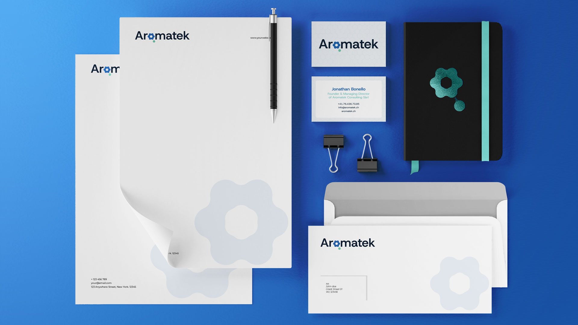
We created the entire visual identity, then adapted it for use across various media: business cards, Word and PowerPoint templates.
For the typeface, we chose Host Grotesk. Its rounded forms soften a sector that can quickly appear austere. As for colours, we stuck to shades of blue – the colours one would expect from a reputable player in the chemical industry – with the turquoise of the logo adding a touch of freshness.
A logo that is part flower, part molecule
The Aromatek logo can be interpreted in two ways. From a distance, it looks like a flower. Up close, it is a molecule: phenol (C₆H₅OH), a six-carbon ring to which an OH group is attached, represented by the small turquoise dot. This small group is found in a wide variety of aromatic molecules.
This symbol encapsulates what Aromatek is all about, bridging the gap between nature and chemistry.
A website that is also a library
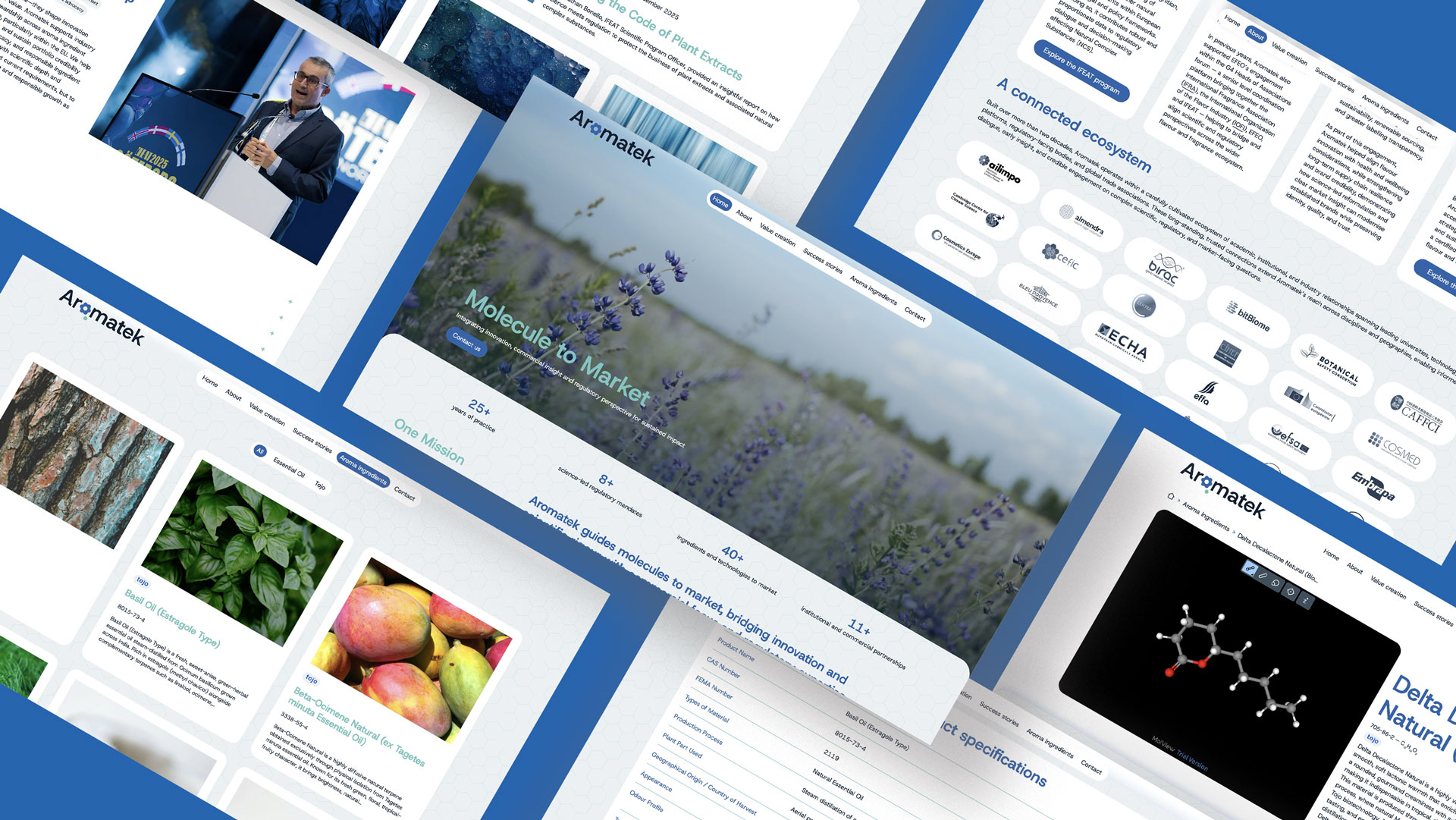
The Aromatek website is more than just a showcase. It features scientific publications, a catalogue of molecules, four areas of expertise and the founder’s background.
With so much content, we focused primarily on organisation: clear navigation and pages that expand when you want to explore further. You won’t get lost, even when reading extensively.
Moving beyond scientific conventions
The conventions of the chemical industry are well known: blue, laboratories, very few people. For Aromatek, we’ve transformed them into something more welcoming and vibrant, featuring photos, videos and interactive elements.