UX/UI Published on by Chloé Chassany
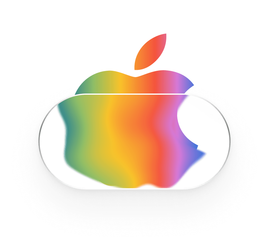
Liquid glass, OK or not OK ?
On Monday, 9 June 2025, at its annual WWDC (Worldwide Developers Conference), Apple unveiled the future of its interfaces by introducing Liquid Glass. This innovation, which surely caused developers some anxiety, marks a turning point in the Apple universe, which has not introduced any major visual changes since the release of iOS 7 in 2013.
By combining flat design and skeuomorphism (imitating the appearance of a real object when designing a virtual object) to achieve an improved neumorphism, Apple will never cease to surprise us and reinvent the UI!
As Apple enthusiasts, we tested various generations of iPads, MacBook Pros, and TVs. After a few days, we can finally provide you with a more informed opinion.
What is Liquid Glass?
We won’t dwell on the presentation of the new design, called ‘Liquid Glass’; the video above speaks for itself. Apple’s goal is to ‘make apps and system experiences more expressive and engaging, while retaining their familiar character.’
Available on all platforms (iOS 26, iPadOS 26, macOS Tahoe 26, watchOS 26, and tvOS 26), Liquid Glass will be rolled out in three stages: starting today in developer beta, from July in public beta, and from this autumn for the general public.
A visual innovation, but…
Visually stunning, there are still a few issues that the beta will gradually reveal. It is precisely these issues that we want to address.
But first, let us share our initial reactions to the video above. Aside from the initial ‘Wow!’, ‘Not bad!’ and ‘Apple is amazing!’, we wondered about the production. We also wondered about this last autumn with the new wallpaper customisation system.
Although the production is well done and polished (magnificent reflections, well-managed blurring, etc.), accessibility and adaptability are lacking. Transparency management is a double-edged sword: on a light background, there is no adaptation to allow for easy reading.
Without a background with a minimum of dark colours, interface elements are completely unreadable. This is a real accessibility error. However, according to the WCAG (Web Content Accessibility Guidelines), it is advisable to maintain a contrast ratio of at least 4.5:1 for normal text and 3:1 for titles for level AA, and 7:1 and 4.5:1 respectively for level AAA.
You can test the difference on our portfolio, where the colours of the text on the cards are governed by this rule.
Everyone is free to choose their own wallpaper, but this new feature ‘forces’ you to choose a version with as little white space as possible.
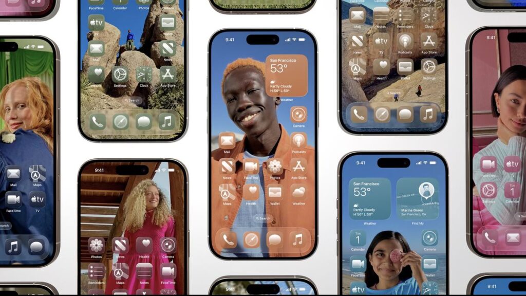
Of course, with beautiful, high-contrast photos and maximum customisation, the screens look stunning… But who spends so much time customising their wallpaper?
What about other operating systems?
On other operating systems, the same problem arises: poor readability due to low contrast, display bugs, etc. And there is another problem to add to the list: screen quality.
On a 2019 iPad Pro, the rendering is not up to scratch, with pixelation or no transparency in certain areas…
With TV OS, it all depends on your television! If, like us, you have tried Apple TV on a screen that is a few years old, you will lose transparency. In fact, you will only see a blurred background… It’s a shame, because not everyone upgrades their digital equipment every year!
Any innovations planned?
Of course! The current beta is only iOS 26.0 Developer Beta 1! So there are still several improvements to be made before it’s ready for public release. The social media design and development community will be sure to point out every little detail that needs to be fixed, giving Apple a wonderful to-do list!
We hope to see the beta testers’ feedback incorporated into future updates!
Want more details?
While researching for this article, I contacted Mat from Prof du web and Apple, différement who had posted on Threads about his desire to interview an interface specialist on the subject.
Once that was done, we recorded a podcast episode together, which you can listen to here!
(For the best experience, we invite you to listen to the podcast on the Apple app, where the chapters are illustrated with examples.)